Bands
For all band options and API docs, see the Band reference in Pattern Lab.
A band is a full width container that goes edge to edge on the display. Bands can contain multiple internal components, and help chunk related content together in a section of a page.
All band components can accept any of the color themes: xdark, dark, light and xlight. You can also add options such as background images, a texture, or an expandable video.
Best Practices
Use bands to group related information together
In Gestalt, the principle of common region states that when objects are contained within the same closed region, they're perceived as belonging together. When putting information within a band, ensure that all the elements within the band relate to each other logically.
Avoid "striping"
The goal of a layout is to create a clear visual hierarchy, and to allow users to consume the information in an effective way. Including too many bands on a page interrupts the flow of information and creates a visual stopping point that may reduce further engagement. In fact, evidence from usability testing shows that long horizontal bands across the page, particularly if they end or begin near the bottom of the "fold," discourage people from scrolling.
Focus on legibility
When putting content in bands, make sure to pay attention to the legibility of the content against the background. Avoid choosing "busy" images that create too much noise in the background, or using an image that's too light for the text on top of it.
Full-bleed background images
Full-bleed background images grow to fill the available space of their container. Often that means parts of an image will not be visible. On wider screens the top and bottom may be cut off, on narrower screens the left and right. The amount of content inside the container also determines the size and crop of the background image. Therefore, it's hard to know just how much of your image will be visible on each device.
The best practice is to use full-bleed background images as decoration only. They should not contain content that would be confusing or distracting if it were cropped out. You may use an image with an interesting focal point, just choose one that still works when only partially visible.
Examples
Below are the most commonly used band types with examples.
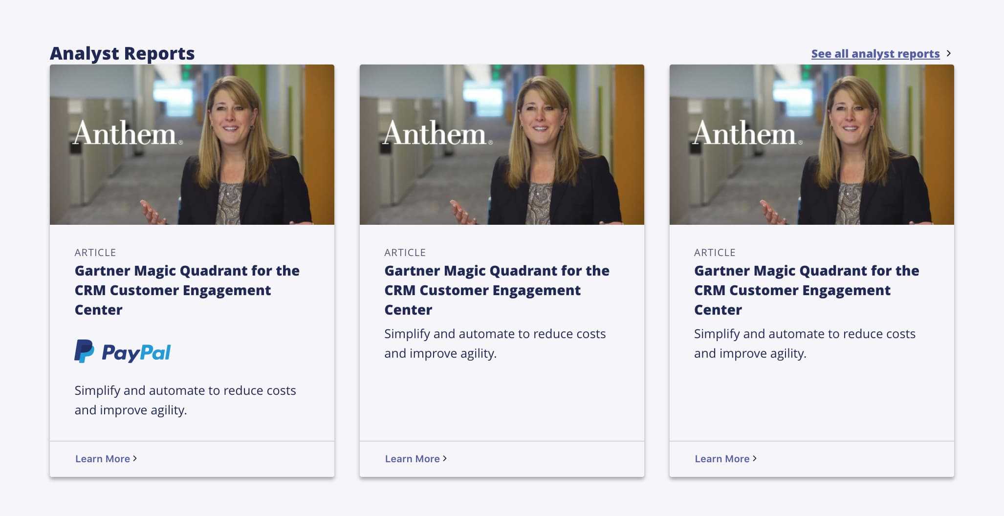
Collection Band
A collection band contains a series of teasers or cards, with the option to add images and links to resources, pages, etc. Use consistent content within teasers (eyebrows, similar headline lengths, etc.) to improve scannability.
Action Band
The action band includes a series of links associated with icons. Use an action band to point visitors to important sections of an experience, or to highlight specific categories of content. Limit action bands to 6 items to avoid wrapping to a second row on wider screens.

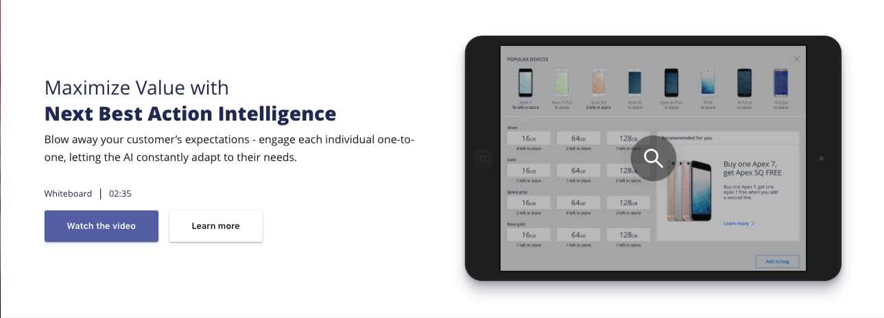
Feature Band
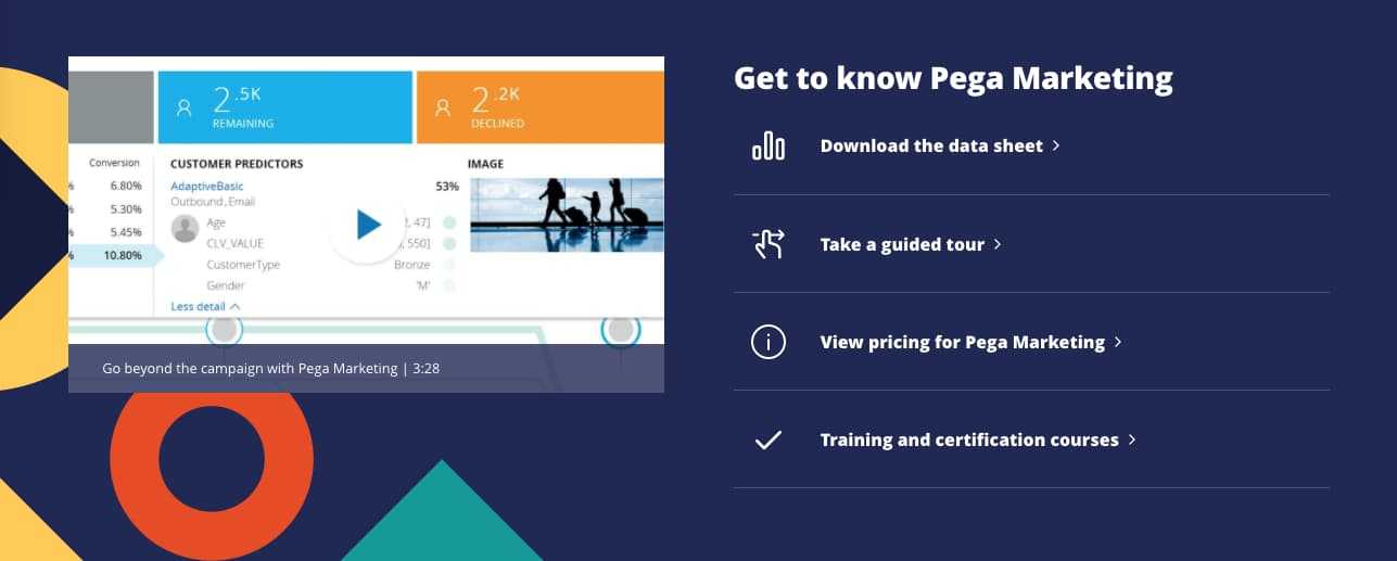
The feature band provides the most flexible options for mixing content, interaction and images. It's best used in cases where you want to display blocks of content side by side, e.g. an image or video next to a teaser, or a list of assets next to a headline and teaser.

Flag Band
The flag band contains for a brief, highly targeted message with a single call to action. Use a flag band to either create a distinct call to action within a page, or to add supplementary messaging to the elements above or below the band.

Index Band
Use an index band to group distinct sections of text-based content, such as teasers and headlines. Each index band can have a headline and teaser, along with 2 or more chunks of content. For optimal visual flow, ensure that the types of content you include are consistently constructed, e.g. word counts or content types.

Lockup Band
A lockup band focuses content on a single, high-value message, with a number of supporting messages to the right of the main focal point. On page load, the primary message in the band switches, allowing each of the distinct content bundles in the lockup band to take center stage.

Body Content Band
The body content band helps content authors create more robust content sections within a page. Use this band to add article-length content to pages, or when you want to use centered content in a band.
